Examples Of Flat Design VS Realism
You may have seen the award winning website http://www.flatvsrealism.com by Intacto showing is the epic battle between flat design verses realism, but as wonderful as it is it really doesn’t give up to date examples (possibly due to it being made in 2013). So we’ve decided at Surge that we ought to share with you some of the more current examples and trends in the world of web design!
Firstly we need to explain the difference between flat design and realism. Flat designs are simplistic images with no shadows to make them pop out of the page. Realism, otherwise known as Skeuomorphism, is when a design imitates real life using shadows.
Let’s take Super Mario for example. When the game was first created we were greeted with an 8 bit character with a flat 2D design. Now we can see Mario as an almost real life 3D human being, the difference is that in gaming you always strive to create the most realistic gaming experience. In web design, it has now become the complete opposite.
Realism was the latest trend in web design and logo creation, for several years, but we’re now in an era where we appreciate the simple things in life better. With page load speeds becoming key to keeping people on your website and responsive web designs taking over desktop use, it’s no wonder large companies are Ditching detailed graphics for more basic ones.
In 2014 we have seen several companies change their logo to a flat design, including About.com and Hershey’s. Hershey’s actually dropped the apostrophe in their logo, giving them a new name. But the most noticed logo change was from media giants Netflix, whose change may have been small but made a noticeable difference as you can see from the image below.
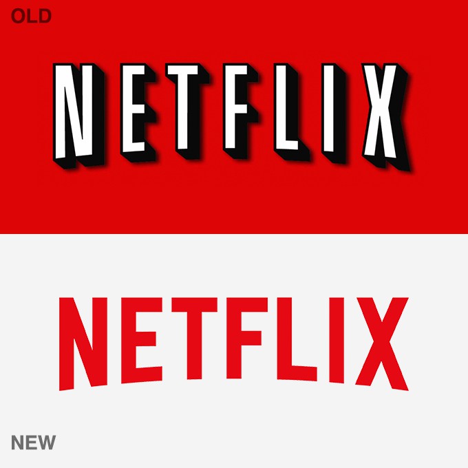
As you can see, the change is very minimal; they inverted the colours and removed the shadowing around the letters. However, because the colour was inverted, we went from a very stark red background to a simple white or black one. Simple designs like this have been trending a lot in 2014, with many websites actually designing their websites with white backgrounds and black lettering. Good examples of this can be seen with ASOS, Vogue and Marks & Spencer.
Netflix aren’t the only company to adopt this flat design change either, as you can see in the examples below.
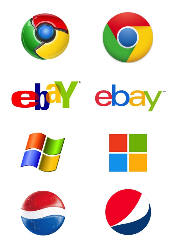
When Google first brought out their web browser, Chrome, they had a 2D logo. They kept this logo for 3 years until March of 2011 when they launched a brand new logo, a logo that was in fact 3D in shape. This was such a radical change at the time that everyone was in awe, loving the detail of the image. But in late 2013 Google did a complete 180 turn, deciding to make all of their logos (not just Chrome) into flat designs.
As for rival Windows, they took a slightly different approach. They started with a flat design and kept it all the way until the release of Windows XP in 2001. It was then they adopted the more realistic design, which has been kept up until the release of their latest version of Windows in 2012. The example above is actually of the Microsoft Mobile logo, but it won’t be long until this becomes the standard Windows logo. You can find various company logos on this helpful site called Logopedia, where you can see the history of a company logo.
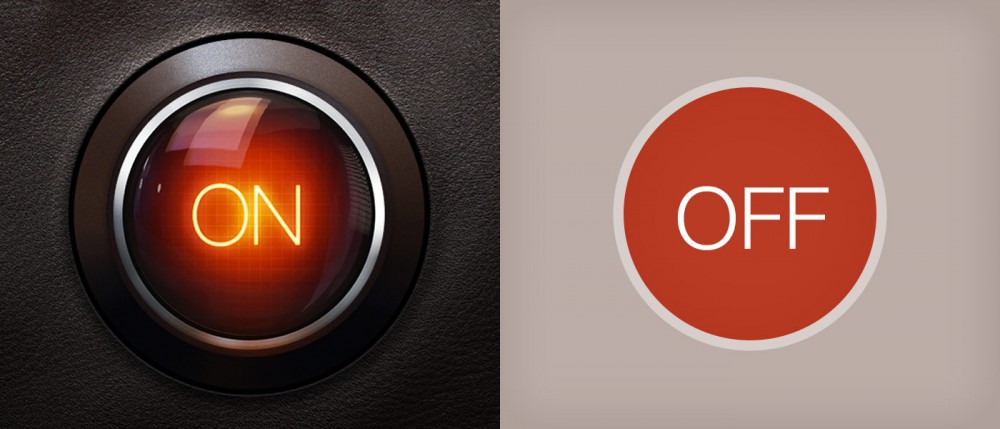
Have a look at the image below…
The average person would possibly look at this and think of the word “shading”. Shading itself is not the reason for a design becoming skeoumorphic, it’s shadows. The difference between a shadow and shading is that a flat design can include shading and still be flat, just like the flat design used in Intacto’s design. Shadows make the object instantly more realistic, like it’s popping out of the page or screen.
So those are our examples, we hope that they were helpful! If you want to redesign your website you can always visit out web design page where you can see what we have to offer and previous work done.